You've probably absorbed the idea that the American economy has been racing ahead while Europe stagnates. It comes up constantly — in coverage of Trump, in debates about European defence spending, in hand-wringing about why Silicon Valley happened in California rather than anywhere on this side of the Atlantic.
But as Paul Krugman and Seth Ackerman have pointed out, the numbers that underpin this story are fragile in the extreme. Work through the statistics problems one by one, and the gap largely disappears. For European politicians being lectured about the urgent need to dismantle their social models and become more like America, it's worth knowing that, but for a series of statistical quirks, they could be arguing the reverse.
The truth about GDP numbers
GDP is a poor measure of human well-being, and the way it is calculated is subject to multiple measurement challenges. If you try to compare its performance over time and across countries, those errors compound and can lead to highly misleading conclusions.
hamsterThe fundamental issue is that comparing the size of two economies is much harder than it looks. There are three major problems, and in the US-Europe comparison, they all bias results in the same direction — towards apparent American outperformance.
Exchange rates move for reasons unrelated to economic performance
The most obvious way to compare two economies is to convert everything into the same currency. But exchange rates are driven by a multitude of factors — interest rate differentials, investor sentiment, geopolitical shocks — not necessarily by how well an economy is performing. So if the euro weakens against the dollar, European GDP looks smaller in dollar terms, even if nothing has changed in the daily lives of Europeans.
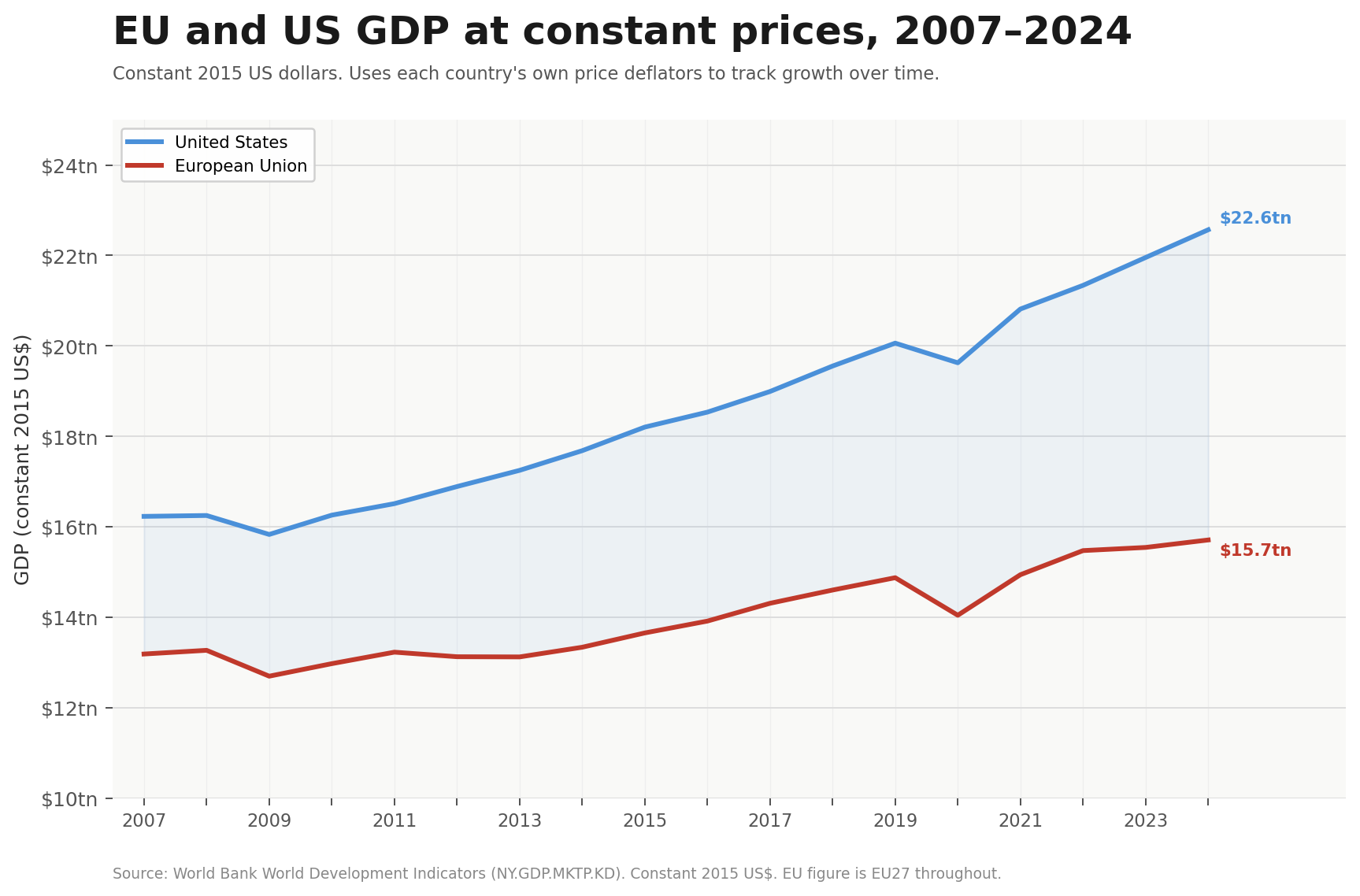
The most dramatic headline figure is this: in 2007, the European and American economies were roughly the same size — the EU actually a shade larger. By 2024, the US economy appeared 47% larger. That sounds like a catastrophic European collapse — and it is the figure that, more than any other, has driven the "failing Europe" narrative in economic commentary on both sides of the Atlantic.
"Krugman notes that this is overwhelmingly a currency story."
At the end of 2007, one euro bought around $1.46. By the end of 2024, it bought only $1.04 — a drop of nearly 30%. That accounts for much of the gap.
The same money buys different amounts in different places
Using an exchange rate for an arbitrary date is clumsy. The Economist's famous Big Mac index exists precisely because of this problem: a Big Mac costs around $5.50 in the US but under $3 in Portugal. A Portuguese worker earning the local equivalent of $30,000 can buy nearly twice as many Big Macs as an American on the same nominal salary, which tells you something important about their relative living standards that a straight currency conversion misses entirely.
Economists use a tool called purchasing power parity, or PPP, which compares what money actually buys in each country rather than what it converts to on currency markets. Constructing it requires collecting and comparing prices on thousands of goods across dozens of countries — a process that is expensive, infrequent and inevitably imperfect. But it is a better measure, and once you use it rather than market exchange rates, the picture changes dramatically.
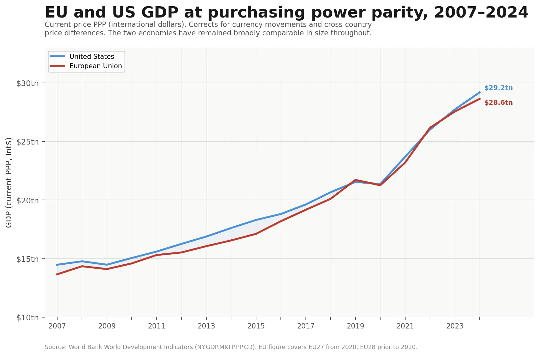
This chart uses international price surveys conducted every few years and regularly updated — which shows the EU and the US running roughly neck and neck throughout the period. There is a slight recent widening, and at the end of 2024, the gap was around 2%. But there is no sign of the dramatic divergence that the headline figures suggest.
The reason this measure performs better than the nominal series is partly that it corrects for currency movements, and partly that it re-anchors to fresh price surveys frequently enough that measurement errors don't have time to compound badly. That second point matters more than it might seem, and it becomes central to the third and most technically complex problem.
Technology goods are almost impossible to price consistently
Standard price comparisons work well for stable products like food or fuel. They work much less well for technology, which improves dramatically over time. When this year's smartphone is twice as powerful as last year's but costs the same price, a statistician has to decide: how much of that counts as a price fall, and how much as unchanged prices for a better product? The answer depends on the quality-adjustment methodology used — and countries use very different ones.
A 1995 study by Andrew Wyckoffa> of the OECD found that changes in computer equipment deflators among OECD countries ranged from plus 80% to minus 72% during the 1980s, with the largest price decline recorded in the US. A subsequent Eurostat study found that price declines recorded by national computer deflators in Europe ranged from 10% to 47% — still far below the American figures. A Federal Reserve study found similar inconsistencies in official price indexes for mobile phones over 2008–2018, ranging from -18% in Australia to -52% in the US to more than -90% in the UK and New Zealand.
These are not small differences in rounding. They reflect fundamentally different answers to the same question about the same products.
The consequence is asymmetric. Countries applying conservative quality-adjustment methods — recording modest price falls for technology goods — end up understating real output growth. The same physical production of better, cheaper goods gets recorded as less economic progress than it actually represents. And because GDP histories are constructed by extrapolating backwards using each country's own growth figures, this understatement compounds over time.
This is precisely what independent evidence suggests has been happening in Europe. When the University of Groningen constructs its alternative GDP measure — anchoring estimates to actual cross-country price surveys rather than relying on national deflators — it finds that European output growth needs to be revised substantially upward relative to what national accounts show. American estimates, by contrast, need almost no revision. The international price surveys broadly validate the US figures; it is the European figures that diverge from what cross-country evidence reveals.
Global supply chains make this finding harder to dismiss. A smartphone sold in Paris contains essentially the same components and offers essentially the same capabilities as one sold in New York — the underlying reality the statisticians are trying to measure is genuinely similar. When European deflators record much smaller price falls for these products than American ones, and when independent cross-country surveys then validate the American figures rather than the European ones, the most straightforward interpretation is that conservative European methodology has been leaving real output on the table.
The effect compounds over time. Ackerman points out that this leads to absurd results: run the constant-price figures backwards over thirty years, and the arithmetic implies the US economy was 30% smaller than Western Europe's in 1990. Nobody believes this — and the Groningen evidence suggests it is largely a product of accumulated European understatement rather than American exaggeration.
A more rigorous alternative
One response to this problem is to minimise the use of national price deflators in favour of international price surveys, and to anchor growth histories to such data at regular intervals rather than extrapolating indefinitely from a single starting point.
The current-price PPP series shown earlier does this partially — it re-anchors to fresh survey data frequently enough that errors don't accumulate too badly. But it still relies on national deflators for the years between surveys, and it doesn't revise its historical back-series when new data arrives.
The University of Groningen's Penn World Table goes further. Rather than pinning GDP levels at a single benchmark and then chaining national deflators indefinitely forwards and backwards, it uses all available international price survey rounds simultaneously and reruns its methodology across the entire historical record each time new survey data arrives. National deflators are only ever asked to bridge the gap between one survey and the next — a period of a few years — rather than to carry the entire weight of long-run historical comparison.
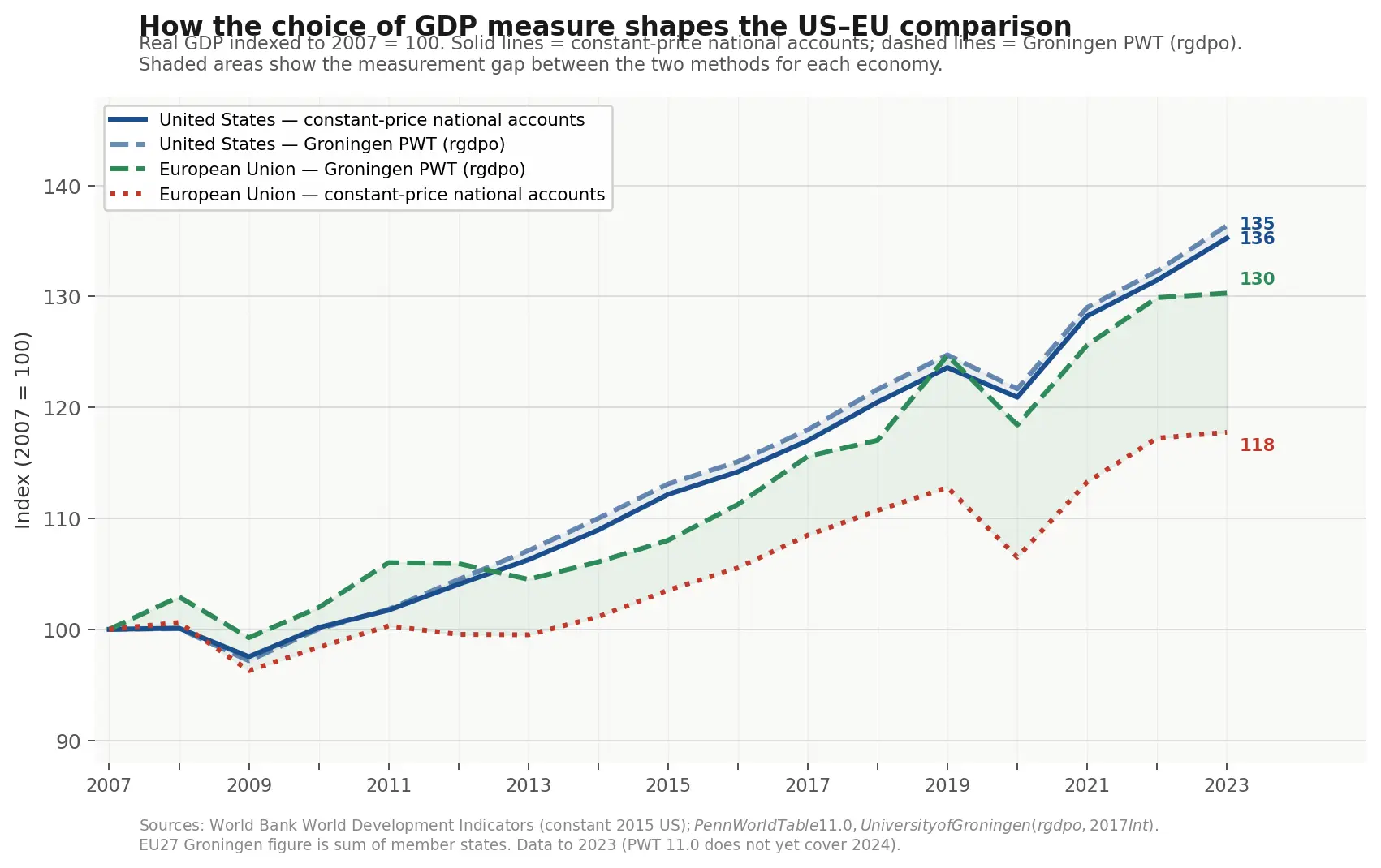
The chart illustrates this directly. The gap between the two EU lines — both purporting to measure the same economy — is the measurement effect. The current-price PPP series, anchored directly to the most recent international price surveys, shows a gap between the EU and the US of around 2% at the end of 2024. The Groningen measure, which is more methodologically rigorous but measures output volumes rather than current price levels, puts the gap somewhat wider at around 8% at the end of 2023 — but shows a very different trajectory from the constant-price national accounts, with the gap between Europe and America far smaller and more stable than the standard figures imply.
UK and Canada comparisons
The UK, like the EU, shows a dramatic apparent gap on constant-price national accounts — growing only 21% over the same period against the US's 39%. On current-price PPP, the two economies track almost identically throughout, with the UK actually running slightly ahead of the US for much of the 2010s.
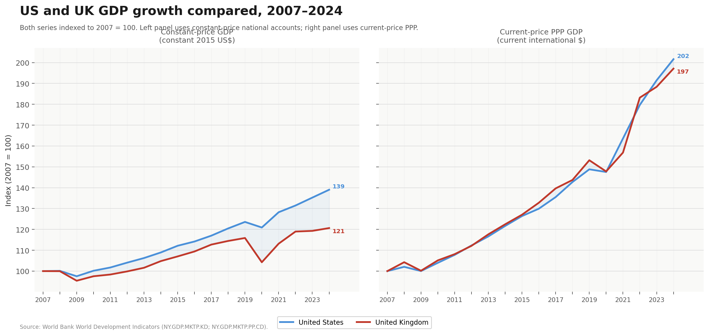
Canada is instructive in a different way. Canada's statistical agencies work within similar methodological frameworks to the US, and the two economies are deeply integrated through trade and supply chains. On constant-price national accounts, Canada grows 32% against the US's 39% — a much smaller gap than Europe's, and one that could plausibly reflect genuine economic differences rather than a measurement effect. On current-price PPP, Canada slightly outpaces the US.
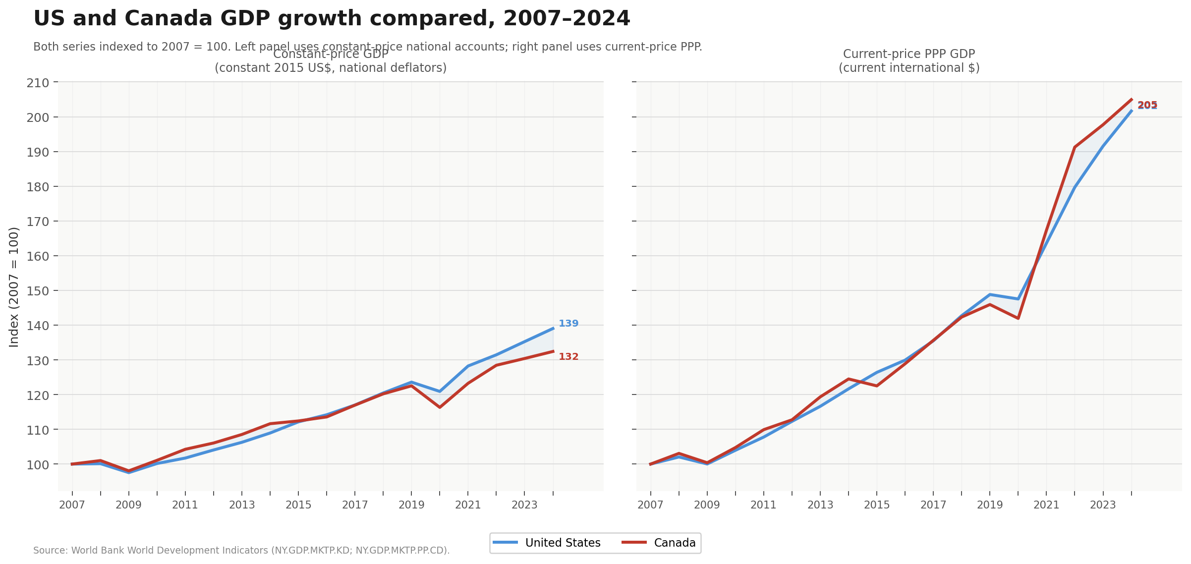
The contrast is instructive: two economies using broadly similar measurement approaches show broadly similar results, while the large US-Europe gap appears only where measurement methodologies diverge. It is worth noting that some of Canada's strong aggregate performance reflects unusually rapid population growth driven by high immigration, which boosts total output without necessarily translating into equivalent gains in living standards per person. But even allowing for that, the methodological contrast with Europe holds.
A word on productivity
Productivity — output per hour worked — is in many ways a more meaningful measure of economic performance than GDP alone. A country can grow its total output simply by working more hours or employing more people; productivity growth is what happens when the same inputs produce more, which is the real source of rising living standards over time. It is also the measure that most directly captures the "falling behind" story told about Europe — the claim is not just that the European economy is smaller, but that European workers are less productive, and becoming relatively less so.
The measurement problems discussed above apply with equal force here, since productivity is calculated by dividing output by hours worked. If output is mismeasured — specifically, if European GDP is understated because conservative quality-adjustment methods fail to capture real gains in technology-intensive sectors — then European productivity is understated by the same margin. The denominator, hours worked, is straightforwardly measured; the numerator carries all the same deflator problems as the GDP figures above.
Ackerman examines this directly. Using the constant-price national accounts series — the standard measure used in most international comparisons — European productivity appears to have been falling behind America's for decades. But when he applies the Groningen methodology, the picture reverses. On the Groningen figures, productivity in Western Europe was running at 92%, 94% and 94% of the US level in the early 2010s, late 2010s and early 2020s respectively — and rising, not falling. Using ILO hours data, specifically designed to be comparable across countries, those numbers rise further to 96%, 97% and 98%.
"Far from falling behind, Europe was quietly gaining ground."
The productivity gap that has animated so much political argument — and so many calls for Europe to deregulate, liberalise labour markets, and dismantle social protections to catch up with America — may be largely a statistical illusion. Not entirely: a gap remains even on the most favourable measures. But the gulf implied by constant-price national accounts, and endlessly recycled in economic commentary, is substantially a result of the measurement choices embedded in those accounts rather than a reflection of what is actually happening in European workplaces.
What does all this mean?
This analysis does not imply that Europe has no economic problems. It certainly does. Productivity growth has been sluggish, demographic pressures are real, and energy costs since 2022 have been a genuine headwind with no American equivalent. There are things the US does better and things worth learning from. The point is not that everything is fine, but that the specific claim — that the American economic model has been vindicated by superior growth performance, and that Europe must converge toward it — rests on statistics that cannot bear the weight being placed on them.
The deeper lesson is about the authority we give to official economic data in political argument. GDP figures move markets and set the terms of public debate. They carry the imprimatur of international bodies whose credibility depends on appearing authoritative and definitive. But as the economists and statisticians closest to the data have been quietly pointing out for decades, these figures embed choices about what counts as growth. When those choices consistently advantage one side of an argument, the least we can do is consider the flaws in the stats.
A tale of two statisticians
Imagine two identical economies — call them Alphaland and Betaland. Both produce the same goods in the same quantities. The only difference is how their statisticians measure technology prices.
In Year 1, both economies produce 100 computers, each sold for £1,000. Total output: £100,000.
By Year 5, both economies are still producing 100 computers — but each one is now twice as powerful as before. The price is still £1,000.
Alphaland's statisticians use aggressive quality adjustment. They reason: the computer costs the same but does twice as much work, so in real terms the price has halved — we are effectively getting twice as many "real" computers as before. Betaland's statisticians are conservative: the sticker price didn't move, so they record no price change.
| Economy | Year 1 output | Year 5 output | Recorded growth |
|---|---|---|---|
| Alphaland (aggressive adjustment) | £100,000 | £200,000 | +100% |
| Betaland (conservative adjustment) | £100,000 | £100,000 | 0% |
Now run it backwards
This is where the compounding effect bites. Suppose an international body wants to compare the two economies going back in time. It knows they are the same size today — both £200,000 in current terms — and extrapolates backwards using each country's recorded growth rates.
Alphaland recorded 100% growth, so working backwards: £200,000 ÷ 2 = £100,000. Correct. Betaland recorded 0% growth, so working backwards: £200,000 ÷ 1 = £200,000. Wrong — the economy appears not to have grown at all, so its historical size must equal its current size.
| Economy | Current size | Implied Year 1 size | Actual Year 1 size | Error |
|---|---|---|---|---|
| Alphaland | £200,000 | £100,000 | £100,000 | None |
| Betaland | £200,000 | £200,000 | £100,000 | 100% overstated |
The more years you stack on top of each other, compounding divergent growth rates, the larger this phantom historical gap becomes. Note that the distortion can run in both directions. The key point is not which direction the bias runs for any given country, but that incompatible methodologies produce phantom historical gaps that have nothing to do with economic reality. The Groningen evidence suggests that in the real-world US-Europe comparison, it is Europe that has been playing the role of Betaland.